All work
Redesign concept / Japanese dining
Rockuman
A richer sense of place.
The design intent
A richer sense of place.
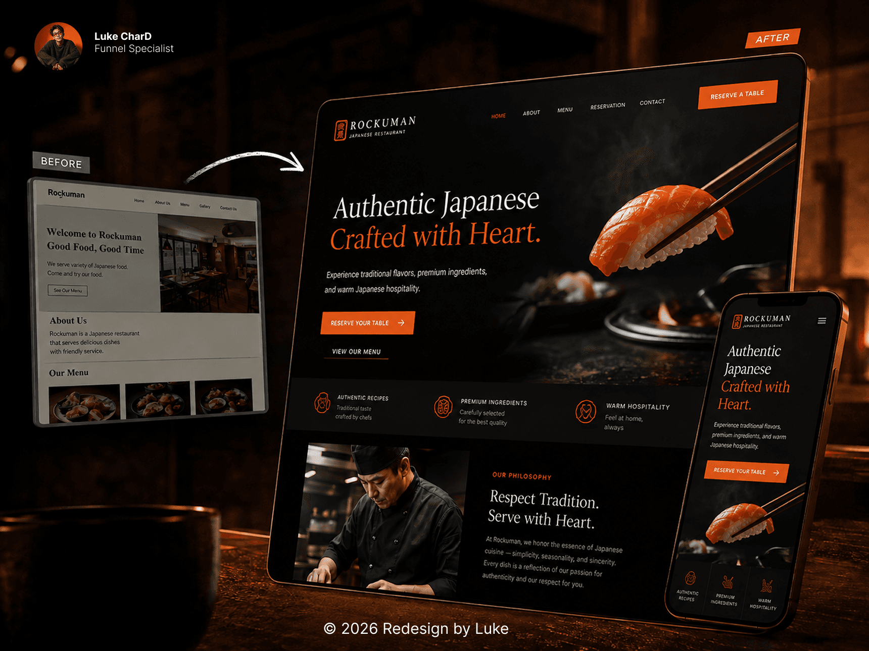
A before-and-after design exploration for Rockuman. A restaurant redesign transformed from a simple page into a richer, atmospheric brand experience. The comparison is a visual study, not a claim of a commissioned redesign or measured business results.
- 01
Reconsider the first impression: how the main message, imagery, and visual hierarchy work together to introduce the business.
- 02
Compare the two directions as a whole. The aim is a more coherent presentation of the offer, with a clearer visual route to the next step.
The comparison.
Concept exploration